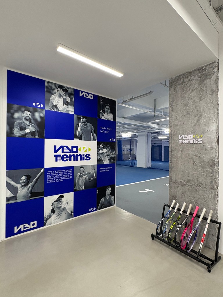
NEO Tennis 尼奥·网球
“因为打网球认识了一群非常可爱的小伙伴,大家平时一起练球,一起组合。但是由于天气和场地原因经常找不到合适的场地训练。于是,就萌生了做一个训练馆的想法。在大家集思广益下,就有了NEO尼奥网球学练馆。初心是通过网球锻炼我们的身心,结交有趣的朋友,为大家提供一个交流分享的平台。我们的口号:”Hello. Neo. Let’s go!” ” —— by D.soul
Logo设计寓意
受 NEO 网球公司的委托,CHAOS-NIN 工作室为其设计了一个全新、有意义且现代的标识。该设计灵感来自一个网球撞击地面留下的椭圆形的痕迹。突出了网球动态与竞技性,同时椭圆形有围绕合作的寓意。NEO本身就有创新的意思,所以将字幕NEO反写。希望将网球视觉提上一个新的多样设计。也符合D.soul所表达的工业风,现代极简,人性的化的设计要求。E的反写演绎成网球场底线的透视效果。Tennis的首字母T设计成了网球的中网,竖4横6的线代表最初的发起人为4女6男。
我们采用了一种独特的视觉方法,灵感都来自网球的语言,独特的图形元素与强烈的签名相结合,创造出一种动态的视觉环境,与 NEO 未来的网球运动相一致。
Commissioned by NEO Tennis, CHAOS-NIN Studio created a new, meaningful and contemporary logo. The design is inspired by the oval shape of a tennis ball hitting the ground. The oval shape emphasizes the dynamics and athleticism of tennis, while the oval shape symbolizes the collaboration around NEO, which in itself means innovation, so the subtitle NEO is spelled backwards. It is hoped that the visualization of tennis will be brought up to a new and diverse design. It is also in line with D.soul’s design requirements of industrial style, modern minimalism and humanization. the reverse of E is interpreted as the perspective effect of the bottom line of a tennis court. the initial T of Tennis is designed as the middle net of tennis, and the vertical 4 and horizontal 6 lines represent that the original initiators are 4 women and 6 men.
A unique visual approach was adopted, all inspired by the language of tennis. Unique graphic elements were combined with a strong signature to create a dynamic visual environment, in line with the future of tennis at NEO.